XII lines of tides
concept
A tide calendar for surfers
An infographic project that helps surfers plan their perfect waves a year in advance. It’s like a crystal ball for wave hunters, but based on actual scientific data. Self-released and self-managed.

The goal was to create a tool that would extend tide predictions from the usual one-week forecast to a full year. This meant diving into new territories, including learning the Processing programming language and, surprisingly, dealing with the UK Hydrographic Office for buoy data.
Situation
I surf, and whether a trip is worth taking depends on the tide. Official tide data is published two weeks ahead at most — enough to plan a weekend, useless for planning a season.
Action
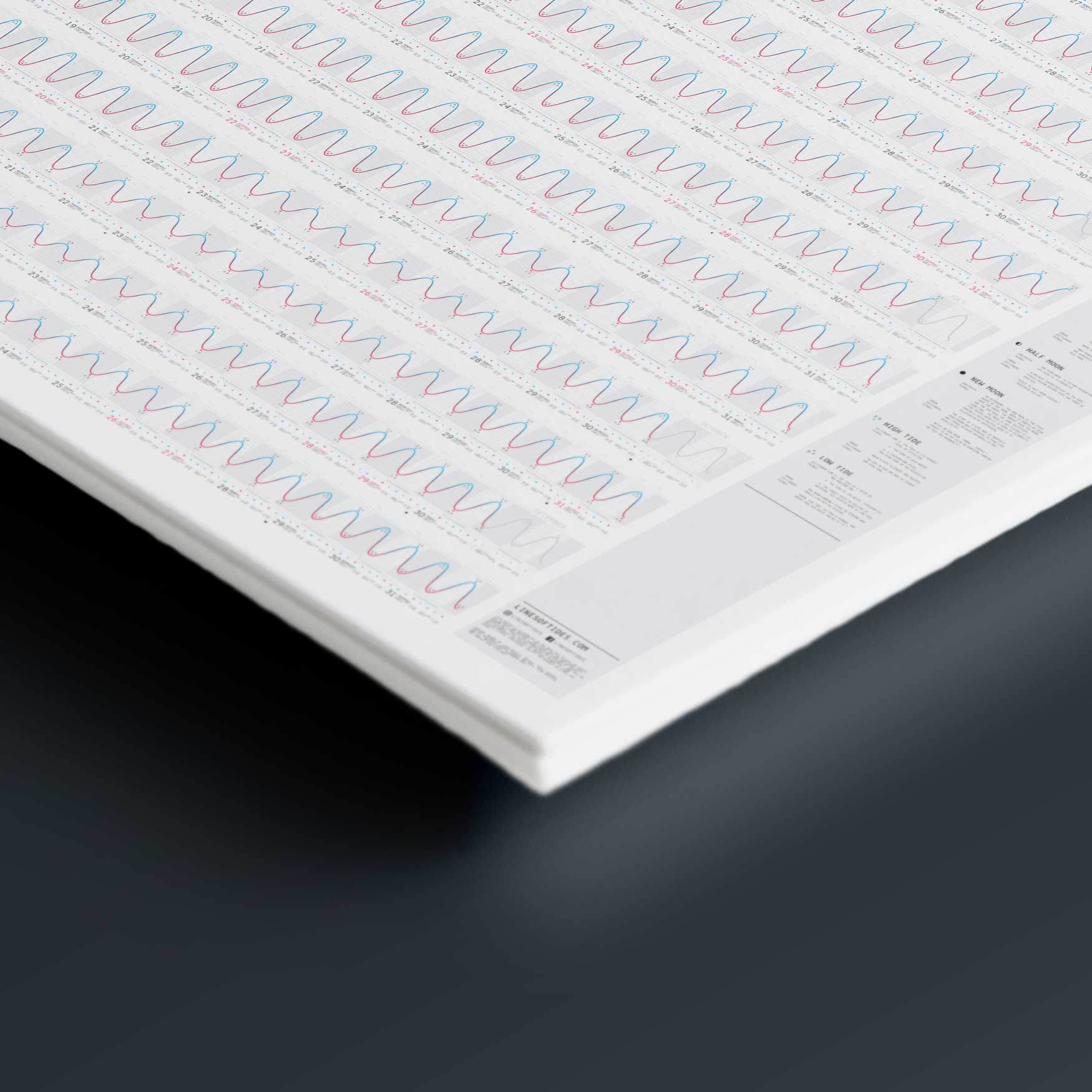
I learned Processing to generate the charts and sourced the underlying data from the UK Hydrographic Office. Every day of the year is drawn as a single sine curve — tide height at the peaks and troughs, the hour scale beneath, and first light, sunrise, sunset and last light alongside it. Then I had them printed, built a store and ran ads for it.
Task
Extend tide prediction to a full year and put it where a surfer would actually look: on the wall, not behind an app. One sheet per break, for the best-known spots in Portugal.
Result
Posters shipped for several of Portugal’s best-known breaks, and a few copies travelled as far as Indonesia. The advertising never produced the demand the project needed to pay for itself, so the remaining run went to surf schools and friends. It works better as an object on a wall than as a business.
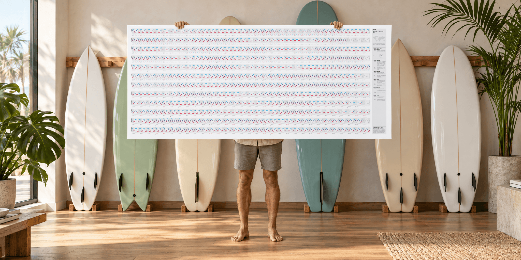

A day is one sine curve: tide height at the peaks and troughs, the hour scale beneath, and first light, sunrise, sunset and last light for every date.



Role
Self-initiated
Period
2020 — 2022
Platform
Mixed Media